Color Theory
Color choice matters. Having the right colors, represent the right things, in the right places, act as visual cues to website visitors and mobile app users without requiring them to process words to understand where one step leads to another.
Beginning
Early color theory ideology is fairly common as it’s frequently taught in primary school art classes. Light and dark colors for contrast, chroma for saturation and intensity, hue that identifies colors.
The first stage of color theory, historically, was the identification and mixing of what is commonly referred to as primary colors – we all know these as Red, Blue, Yellow. The idea that mixing primary colors can create all colors, though antiquated, does provide the basic understanding of how we understand color. Our perception and manipulation of physical colors in the visible spectrum not only gets identified at an early age, but we also start to be indoctrinated – in a way – to how those colors should be perceived.
Perception
A large portion of color theory focuses on the scientific and artistic combination of colors to create alternating hues and saturations in an effort to produce a type of harmony. In interface design, color theory can be used to leverage the fundamentals of color identity, harmony, and how various colors work together to provide intuitive interface objects that don’t require much more than simply recognizing contrast in areas that make intuitive sense to users.
- Dark backgrounds on buttons against light content containers
- Lighter font colors for links amongst dark paragraph context
- Saturated backgrounds on objects housing navigation or areas of interest
- Related, harmonious colors for active application states
These things, albeit basic, are cornerstones for how we intuit separation between areas of focus and areas of importance. Using these fundamentals, we can leverage the psychology of colors and perception of them to optimize the flow of an interface and greatly decrease friction from point to point within conversion funnels.
Optimize
When addressing your application or website and trying to reduce friction as much as possible, here’s a list of questions to run through. The answers to these questions require an understanding that humans are inherently impatient, have far more options at their fingertips than ever before in history, and will follow the path of least resistance on their quest to improve or add to themselves, their lives, their possessions, or their business.
- Are links easy to discern from regular text?
- Are links concise? (1 – 4 words, as to not be confused with emphasized text)
- At first glance, can you spot the most important button on the page without reading it?
- Do you have instructions for how to get from one area of your interface to the next?
- Is your navigation hidden?
- Without reading, can you see the most important objects on the page that aren’t images?
The common thread, can you move from the landing area of an interface to a conversion funnel, without reading or thinking about it? Proper use of color will allow users to achieve this. The effort needed to make a large impact is minimal, the results can be remarkable, and if done correctly, your app or website should also end up looking more polished and well thought out.
Association
Written copy is important for a number of reasons; it’s good for search engine optimization, people generally like to research their decisions prior to coming to a conclusion, and it gives you a means to provide users a reason to stay. What it doesn’t provide is an opportunity to instruct or guide – often.
This doesn’t mean you don’t have an opportunity to instruct of guide, but unless your brand is established and people are seeking you out already sold on understanding the expected outcomes of using your app or website, it is important to allow inference from presentation. Some examples of how this applies to primary brand establishment:
- Forest Green is commonly associated with finance
- Pastel blue or vibrant, saturated primary colors, association is social media
- Pure blue, the association is medial or dental
- Navy is commonly associated with government entities
- Red is very commonly used in the food industry, as well as vibrant orange
Knowing common threads for how colors are associated to industries by consumers at scale is a matter of conditioning over time. This doesn’t mean there isn’t flexibility in color palette for branding but it should help drive decisions on imagery and focus of elements that can easily draw the relationship between your website or app and industry it serves.
On a micro scale, color association for affirmation is as simple as not using red, which typically translates to error/stop/cancel. Oddly enough, green is too obvious and shouldn’t be used for calls-to-action, if you can help it. Blues, yellows, oranges, and monochromatic colors are all great for drawing attention to objects, as long as the contrast is elevated against the common environment of the interface design.
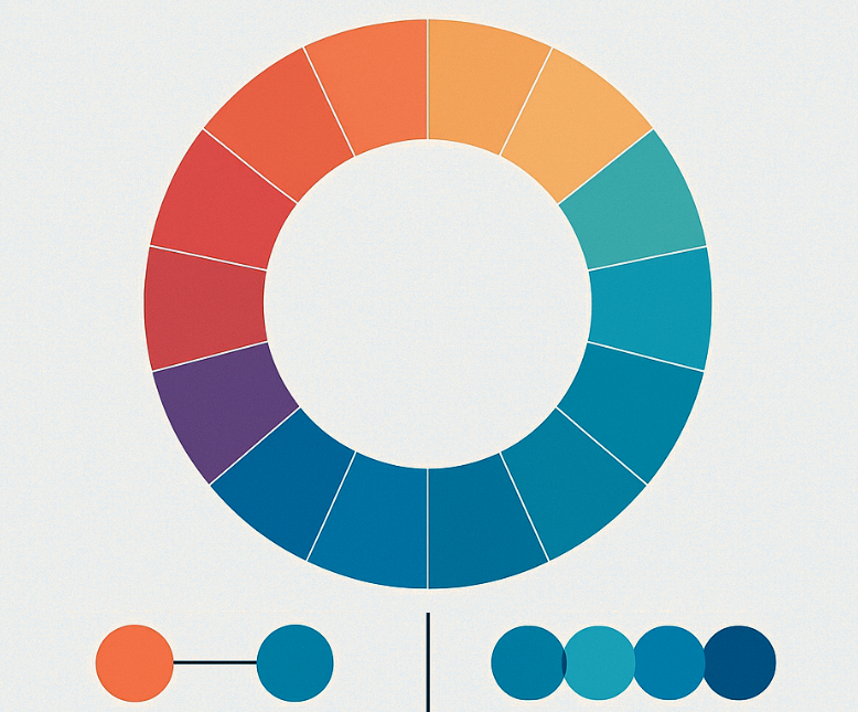
Palette
Every interface should include at least three colors that are associated to your brand. Brand colors typically come from personal decisions or a design agency, but from that the brand colors can be used to determine contrast hues to use for calls to action, hover/action states, and interface emphasis zones.
Common color harmony variances follow these rules:
- Analogous: A series of colors very closely related in hue to one another, slightly shifted, all with the same saturation levels.
- Monochromatic: A palette very closely related saturation shifted
- Triad: A variance of colors offset to provide a set of complimentary colors that reside along the same hue level
- Complimentary: Linear offset colors that are directly opposite (on the spectrum) in relation to the first color in the provided palette
- Split Complimentary: Linear, angular offset colors that are opposite to the first color provided in the palette
- Double Split Complimentary: Uses the split complimentary then direct complimentary to provide a series of colors offset from the first provided
- Square: A linear cross of complimentary colors based on a single, primary color provided
- Compound: A compressed split complimentary palette that leverages a favored half of the spectrum (cool colors stay cool, warm colors warm)
- Shades: Brightness shift of a single color
The usage of color, properly thought through, balanced and placed into an interface can make a large, positive impact on the performance of a website or mobile application, especially if the goal of the interface is to capture some type of conversion through a funnel or form. The more intuitive and psychologically-friendly the design of your project is, the better it will perform.